Choreographing the Page: Lilia Di Bella on Structure, Flow, and the Reader's Experience
"‘I approached a Dance Mag's visual direction as a foundation, not a constraint,’ designer Lilia Di Bella said. In our conversation, she explains how she drew from her dance background to let shapes and colors flow through the pages, creating a space where "meaning is made together with the reader."
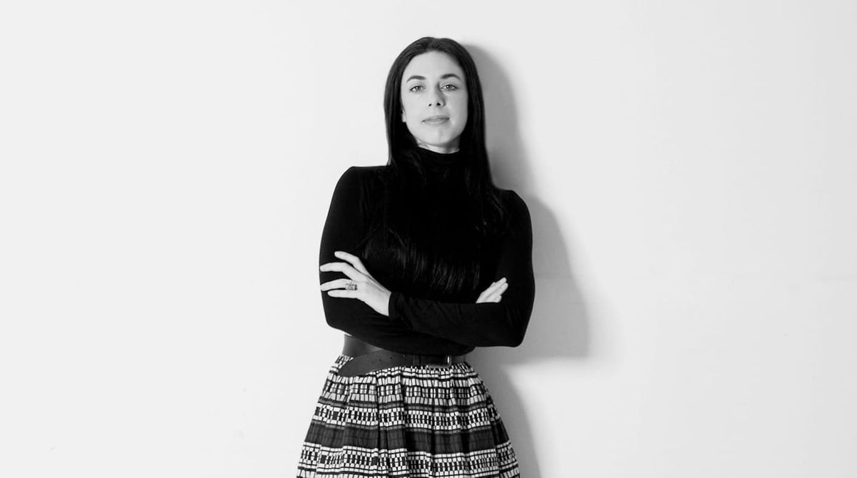
by Jana Al Obeidyine
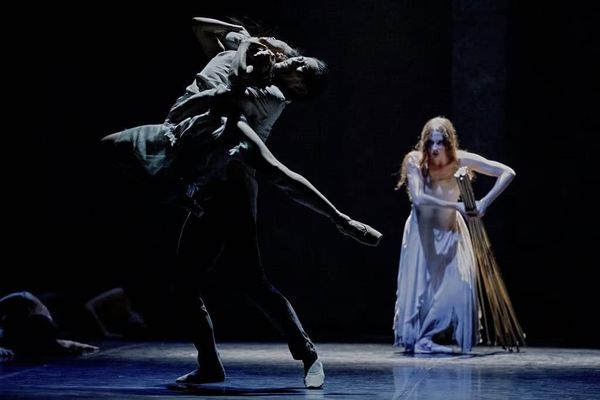
When Lilia and I first met, I loved the idea that she had studied dance before moving into design. Her dance background helps her approach the pages the way a choreographer approaches movement, arranging lines, textures, and colors as gestures within a sequence, creating rhythms between what you see and what you feel.
Working Within the Framework
One of the first things I worried about was her feeling constrained by the magazine's established visual identity, but she said she'd like to "approach ADM's existing visual direction as a foundation, not a constraint." This immediately put me at ease; I knew she was someone who could not only work with the framework but push it further. She saw our established identity as "a flexible framework where my methodology, rooted in movement, perception, and embodiment, could engage." Instead of fighting against what already existed, she explored how "visual elements could flow through the structure to create subtle tensions and harmonies," always thinking about how readers would physically move through and inhabit each page.
Color That Moves Through the Body
Lilia's approach to color was guided by both conceptual and perceptual considerations. "I saw color as a medium that moves through the body, evokes reactions, and directs attention," she explains. For the Structure issue, she chose fuchsia and brown to anchor the pages, creating what she calls "a pulse of tension and release," grounding and contrasting, holding the reader in a specific rhythm. When we moved to Flow, she shifted to blues that "carry the view forward, opening space, evoking air and depth, inviting the reader to drift and move through the magazine with ease." Each color choice was attuned to the rhythm of reading and the atmosphere of the content, making color itself what she calls "a staging of perception."


Space to Breathe
The slightly expanded format we introduced for these issues gave Lilia something she needed. "It created a stage where sequences could stretch, pauses lengthen, and transitions become more fluid," she says. But true to form, she also emphasizes the practical benefits: the larger format allowed us to enlarge the typeface, "improving readability and accessibility, since design is about communicating content and ensuring it can be shared and understood. The expanded format became not only a stage for movement but also a resonant channel for the voice.”
The Challenge of Complex Texts
When I asked what she found most engaging about designing these issues, Lilia pointed to the texts that resisted easy visual translation. Articles with layered meanings or poetic rhythms pushed her to find visual strategies that could echo their complexity without simplifying them. These became opportunities to "experiment with spacing, typographic gestures, and visual tensions, letting the writing resonate in form while leaving room for readers to interpret it themselves."
Co-Creating Together
What I enjoyed most about working with Lilia is how she sees her role. She's not simply translating the editorial vision into layouts; she's co-creating with us. "The editorial content provides the pulse and intention; the design gives it rhythm, materiality, and space to unfold," she explains. She sees herself as a co-creator, designing a dialogue in which content and form grow together. The result feels less like a finished product we're handing to readers and more like an open space where meaning gets shaped by everyone who engages with it. As she puts it, "the magazine becomes an ensemble of editors, designers, and readers, an open process where meaning is jointly produced and constantly renegotiated."
Archive and NABA
This approach is no accident; it comes from Lilia's decade-long work with Archive, the publishing ensemble where she's developed experimental approaches that question traditional author-designer hierarchies. Together with Chiara Figone, she conceived Choreopoethics—a research stream that explores the body as a living archive, movement as knowledge, and choreographic strategies as tools for collective expression and embodied experimentation.
At NABA in Milan, where Lilia teaches Editorial Design, she brings this same philosophy to her students. She encourages them to see visual communication as a means of reflection and social awareness, to pay attention to the lived experience of interacting with images and words. In her classroom, seeing is understood as an active, embodied practice, a rehearsal for engaging critically, creatively, and politically with the world.
Through her work on Structure and Flow, Lilia reframed the pages as spaces where shapes, textures, and colors move through the body. Her work echoed the magazine's ethos perfectly: a space where diverse voices come together, creating what she calls “constellations of perception, culture, and collective encounter.”
Find out more about the Structure & Flow issues of a Dance Mag, here.